Formula 1 driver name plaque
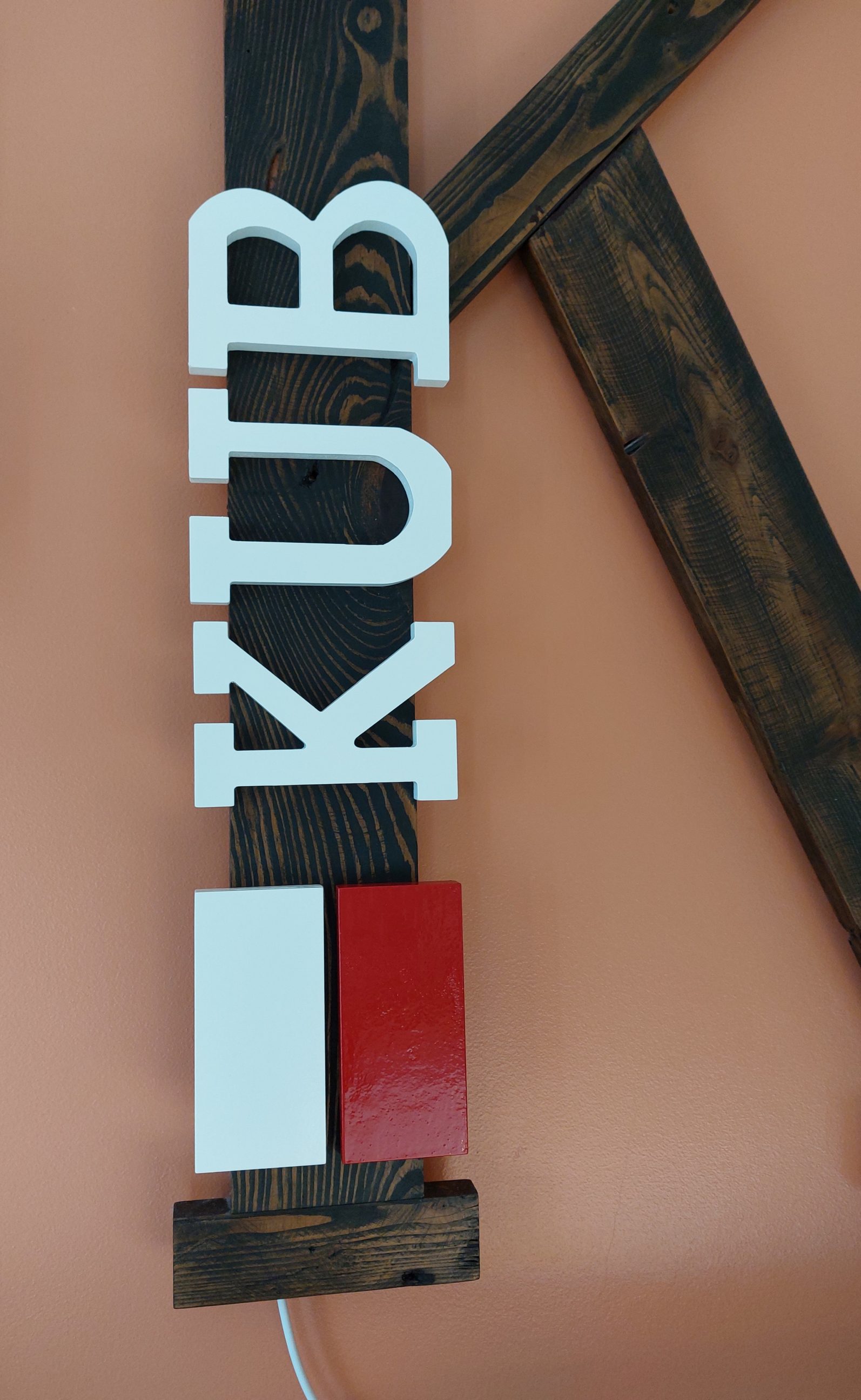
I have been a devoted Formula 1 fan since the moment Robert Kubica, a Polish driver, stood on the podium. As a fellow Pole with a last name starting with the same “KUB” letters, I couldn’t believe the coincidence. I felt compelled to create a sign to honour his successes on the track and to express my own passion for fast and controlled driving. The project itself was not too difficult since I was able to purchase pre-cut and primed letters. While I could have made them myself, I chose the easier and likely less expensive option at the time. My main task was to make the flag. As cutting it was straightforward, I focused on perfecting the finishing process to ensure a professional-looking final product.
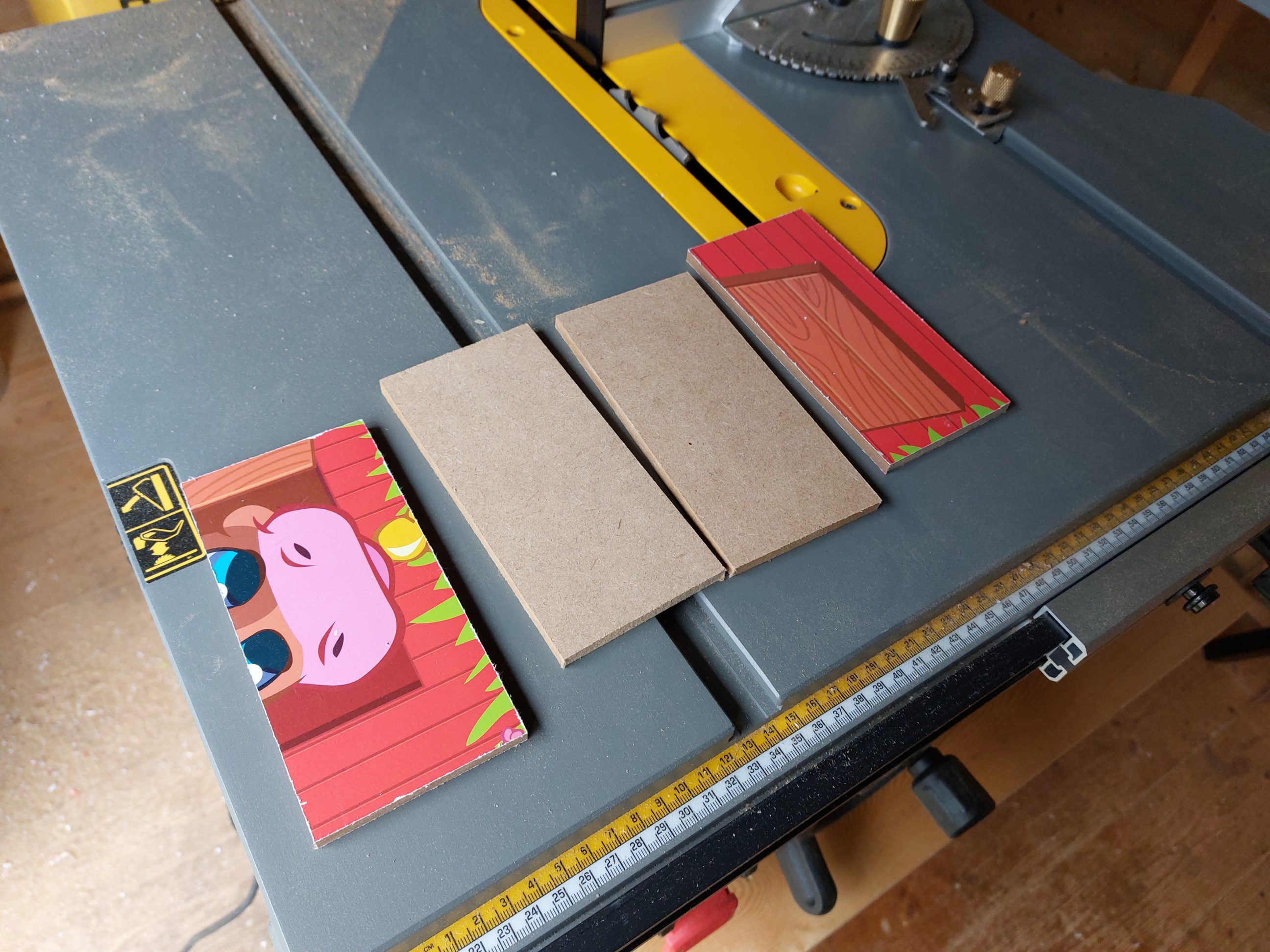


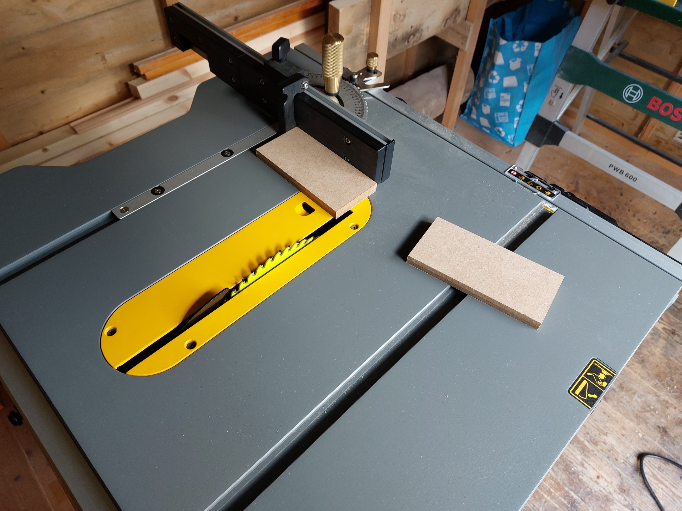
I used scraps of MDF to make the flag. I cut and glued together a couple of 6mm (1/4″) pieces so that the final product would have a consistent 12 mm thickness throughout. I made the pieces slightly oversized and cut them to size after the glue dried. Basically, there was no specific size in my mind, however, cutting off the glue squeeze-out with a brand new 60-tooth blade was a good idea to clean and square off the flag blocks.


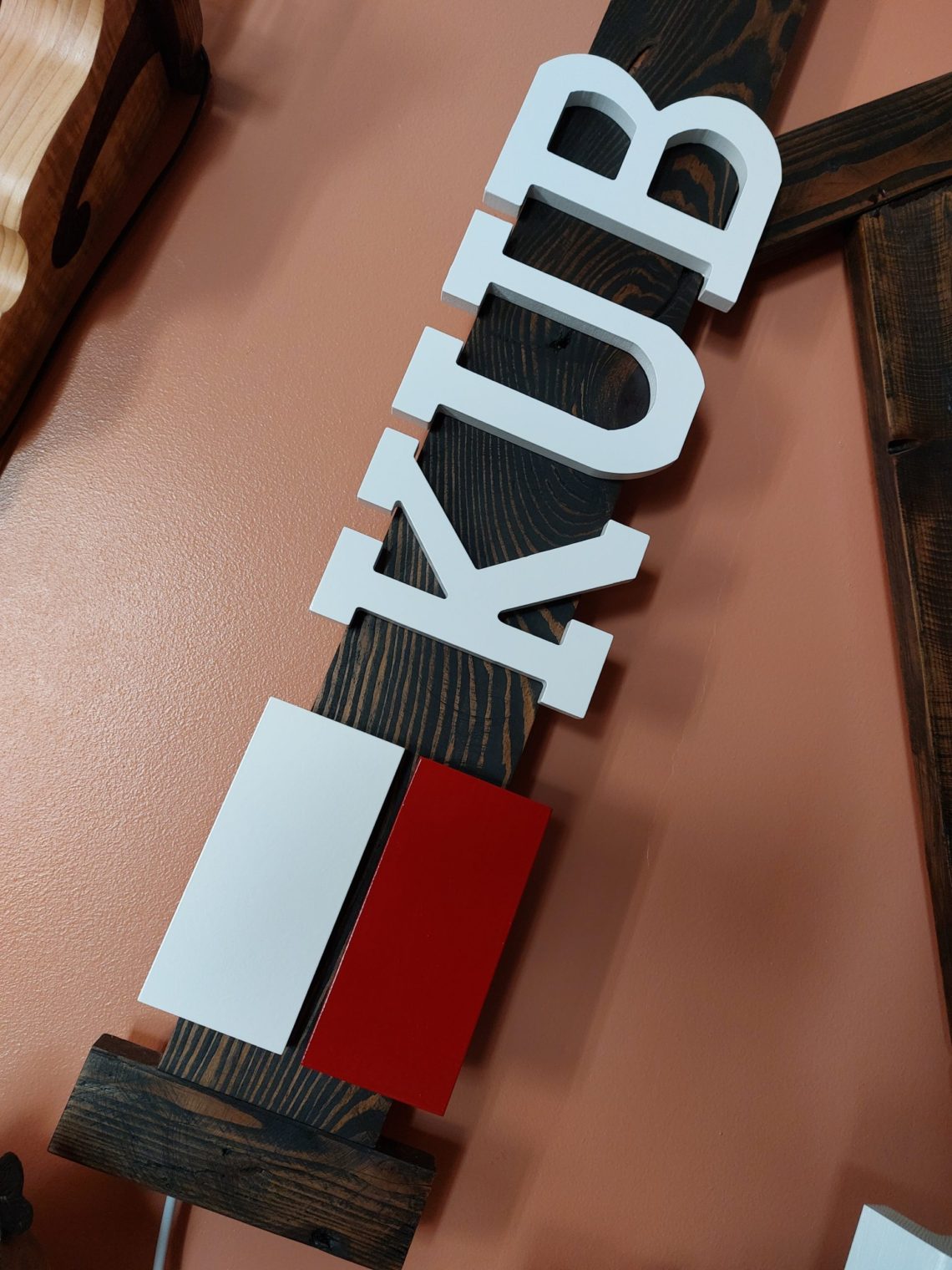
I applied several coats of primer and sanded the blocks lightly after allowing the primer to dry. There were 2 colours of paint to be applied in that project – white and red. Because of the winding edges of the letters I decided to use spray paint and for a much more straightforward lower block, I used old-school methods like brushes and foam. All in that particular order to stay organised with the workflow and to avoid contaminating other surfaces with airborne paint particles. When the spray paint settled down I moved on to the red block, I applied the initial layer with a brush and when it dried, I finished it with a final coat of paint applied with a piece of foam. That gave me a very smooth and sprayed-like texture. I allowed all the workpieces to dry for a day or two and I fixed them to the Letter K with double-sided tape. The order in which they were put together is shown in the pictures below. I made sure that the flag had the same height as the first and following letters, and that the spacing between the letters and inside the flag was consistent. The plaque completes the look of the “Letter K”, makes it even more 3 dimensional and corresponds with the overall look of all of my patriotic projects. It also expresses my interest in motorsports and my passion for professional, fast, and safe driving.